The problem
The problem the client was facing came from a lack of visibility on the Give to UJ website. Many of the programmes and projects, as well as information like how much money was donated so far and how much would be needed was hidden from plain view.
The design of the portal was basic and unfortunetly did not speak to the work being done or spark any enthusiasm about the amazing projects that UJ is looking to fund.
Beyond this, the overuse of the primary Orange colour on the official website portal and offical communications, for the website was an additional issue. The client expressed a need to shift the design aesthetic, within the identity of the institution, towards something that was vibrant, inviting, informative and unique.
Overall needs
A reworking of the website layout. A visual language that inspires the target audience to engage with the website and donate to the initiatives. The visual language needs to be eye-catching and relevant. Reworking the use of colour within the visual language and the incorporation of existing UJ CI as well as vibrant designs specific to this project and the client.
The website
The use of colour needs to adjust with an emphasis on enticing the visitor to make donations through the sight.
There could be a use of the full range of the UJ colours, not just orange.
Needs to easily show where and how donations are used, for example, a running tally on a donation run for a particular initiative. The layout needs to have a high degree of usability that allows the user to get bite-size info on the initiatives available for funding.
Look and feel


The website
The first step towards creating the new version of the portal was to use the layout references provided by the client and by my lecturer. These serve as a starting base for building a working template, these would be done using Adobe Indesign for layout refrences and upon feedback and approval, to be sent to the web developer responsible for the maintenance of the website.
The layout would follow the template used on the FADA website portal, this was done with wordpress. The main images, which feature the target demographic, would be sourced from Unsplashed, with designed, minimalist elements designed on Adobe Illustrator.
The images are used as a guide for the design solution along with a combination of images from the Give to UJ website itself.
The images are used as a guide for the design solution along with a combination of images from the Give to UJ website itself.


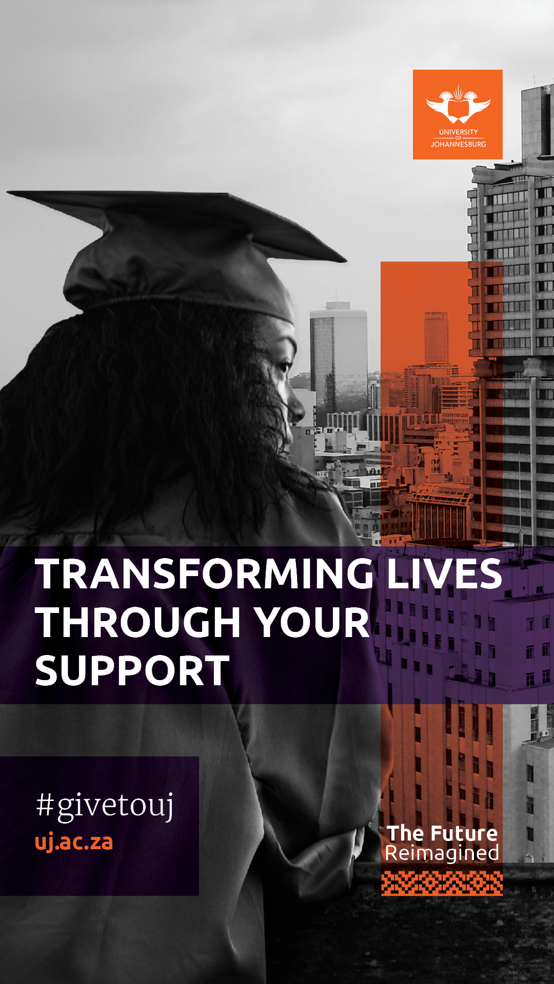
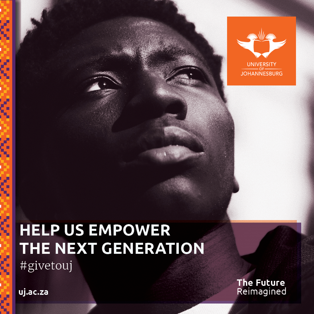
Social Media
This followed a basic design strategy of overlaying key elements and colours from UJ branding to convey the vibrancy and youthfulness of the university. The images were sourced from Unsplashed and show the key demographic of the university, young Africans, young women. The images are used as a guide for the design solution.
The idea is to show who may stand to benefit the most from the projects undertaken by Give to UJ in a young, modern South African society.
The posts feature #givetouj as part of a smaller campaign to raise awareness online for people to get involved with the fundraising. Five variations of Instagram, Facebook and Twitter posts in 1080x1080 as well as story versions of the post are available to choose from. These post layouts will be available and editable in Powerpoint.
1080x1080


1920x1080